Responsive Web Design Company: Why Your Business Needs Mobile-First Approach
The digital landscape has fundamentally shifted. In 2025, mobile devices account for over 60% of all web traffic globally, and this number continues to grow. If your website isn’t optimized for mobile devices, you’re not just missing out on traffic—you’re actively losing customers to competitors who are. This is where responsive web design companies become invaluable partners in your digital success.

What Is Responsive Web Design?
Responsive web design is an approach to website development that makes web pages render well on a variety of devices and window or screen sizes. Rather than creating separate mobile and desktop versions of your website, responsive design uses flexible layouts, images, and CSS media queries to adapt your single website to any screen size.
Key principles of responsive design include:
-
Flexible grid layouts that adjust to screen width
-
Flexible images that scale with their containing elements
-
Media queries that apply different styles for different screen sizes
-
Mobile-first approach that prioritizes mobile experience
-
Touch-friendly interface elements for mobile interaction
-
Fast loading speeds optimized for mobile networks
Why Mobile-First Design Is No Longer Optional
The Mobile Traffic Reality
Consider these compelling statistics about mobile usage in 2025:
-
60%+ of web traffic comes from mobile devices
-
Over 50% of e-commerce sales occur on mobile
-
90% of users check their mobile devices first thing in the morning
-
77% of users abandon websites that aren’t mobile-friendly
-
Mobile conversion rates can be 3-4x higher than desktop when properly optimized
These numbers demonstrate that mobile optimization has evolved from a nice-to-have feature to a critical business requirement. A responsive web design company understands these dynamics and builds websites with mobile users at the center of the design process.
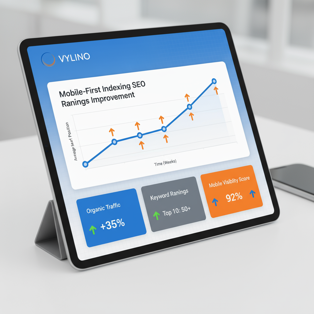
Google’s Mobile-First Indexing
In 2020, Google shifted to mobile-first indexing, meaning it primarily uses the mobile version of your website for ranking and indexing purposes. This fundamental change in Google’s algorithm means:
-
Your mobile website directly impacts your search rankings
-
Poor mobile experience results in lower search visibility
-
Responsive design is essential for SEO success
-
Mobile performance metrics directly affect your rankings
When you partner with a best responsive web design company, you ensure your site meets Google’s mobile-first requirements from the ground up, positioning your business for better search visibility and organic traffic.
The Business Impact of Responsive Design
Increased Conversion Rates
Websites that provide excellent mobile experiences see measurable improvements in conversion rates. Whether your goal is e-commerce sales, lead generation, or newsletter signups, mobile-friendly design removes friction from the user journey and increases the likelihood of desired actions.
Reduced Bounce Rates
A bounce rate is the percentage of visitors who leave your website without taking any action. Mobile users have particularly low patience for unoptimized websites. Responsive design keeps users engaged by providing intuitive navigation and fast loading times, reducing bounce rates by 20-40% compared to non-responsive sites.
Improved User Satisfaction
Users are more likely to return to websites that work smoothly on their devices. A responsive website design company focuses on creating seamless experiences across all devices, building brand loyalty and repeat visitors.
Cost Efficiency
Maintaining a single responsive website costs significantly less than managing separate mobile and desktop versions. You benefit from unified content management, reduced development complexity, and easier maintenance—all while delivering better results.
Learn more about comprehensive web development approaches in our guide on website development services types.
Key Features of a Quality Responsive Web Design

1. Flexible Grid System
Modern responsive websites use flexible grid systems (like CSS Grid or Bootstrap) that adjust column widths based on screen size. This ensures content remains readable and well-organized whether viewed on a 320-pixel mobile screen or a 2560-pixel desktop monitor.
2. Flexible Images and Media
Images are scaled proportionally to fit different screen sizes without distorting. Videos and other media elements also adapt to available space, ensuring optimal viewing experiences across devices.
3. Touch-Friendly Navigation
Mobile users interact differently with websites. Buttons are larger and easier to tap, menus are simplified for small screens, and gestures like swiping are incorporated naturally into the design.
4. Fast Loading Speeds
Mobile users often have slower internet connections than desktop users. A responsive web design company optimizes images, minimizes code, uses caching strategies, and employs Content Delivery Networks (CDNs) to ensure fast loading across all connection speeds.
5. Progressive Enhancement
Progressive enhancement ensures that websites work at basic levels on older devices while providing enhanced experiences on modern devices. This inclusive approach ensures no user is excluded based on their technology.

6. Consistent Experience
While the layout adapts to different screen sizes, the core experience and messaging remain consistent. Users see the same content and brand identity whether on desktop, tablet, or mobile.
Challenges of Creating Truly Responsive Websites
Creating effective responsive websites isn’t simply about shrinking desktop designs for mobile. Several challenges require expertise:
Balancing Content for Different Screen Sizes
Desktop websites often include large amounts of content. Deciding what to prioritize on mobile screens while maintaining engagement requires strategic content planning.
Performance Optimization
Mobile devices have limited processing power and bandwidth. Achieving fast loading times across varied network conditions requires technical expertise and optimization strategies.
Testing Complexity
Responsive websites must be tested on dozens of devices, browsers, and screen sizes. Comprehensive testing requires sophisticated tools and methodologies that experienced design companies employ.
Navigation Design
Navigation that works beautifully on desktop often doesn’t translate well to mobile. Hamburger menus, bottom navigation, and other mobile-specific navigation patterns require thoughtful design.
A responsive web design company in India brings expertise in addressing these challenges through proven methodologies and best practices developed across numerous projects.
Responsive Design Best Practices
Mobile-First Methodology
The mobile-first approach starts by designing for mobile devices first, then progressively enhancing the design for larger screens. This ensures mobile users receive an optimized experience rather than a simplified desktop design.
Performance Optimization
-
Minimize HTTP requests
-
Compress images effectively
-
Minify CSS and JavaScript
-
Implement lazy loading
-
Use browser caching
-
Enable GZIP compression
User Experience Considerations
-
Clear, scannable content hierarchy
-
Readable font sizes (minimum 14px on mobile)
-
Sufficient white space and padding
-
Adequate button/touch target sizes (minimum 44×44 pixels)
-
Simplified forms with few fields
-
Clear calls-to-action
Testing and Validation
-
Test on real devices, not just emulators
-
Monitor Core Web Vitals metrics
-
Conduct user testing with mobile users
-
Regular performance audits
-
Cross-browser compatibility testing
Types of Responsive Design Approaches
1. Fluid Design
Uses percentages instead of fixed pixel values, allowing layouts to flow naturally to any screen width. Highly flexible but requires careful planning to maintain readability.
2. Adaptive Design
Creates specific layouts for different screen size ranges (breakpoints). While offering more control, it requires designing for multiple versions.
3. Hybrid Approach
Combines fluid and adaptive techniques, using flexible layouts with strategic breakpoints. This approach offers the best balance of flexibility and control, and is most commonly recommended by top responsive website designers.
Core Web Vitals and Responsive Design
Google’s Core Web Vitals measure user experience across three dimensions:
Largest Contentful Paint (LCP): How quickly the largest content element loads (target: <2.5 seconds)
First Input Delay (FID): How quickly the page responds to user input (target: <100ms)
Cumulative Layout Shift (CLS): How much the page layout shifts while loading (target: <0.1)
These metrics are critical ranking factors and require careful attention during responsive design implementation. A best responsive web design company optimizes for these metrics from the start, ensuring both user experience and search rankings benefit.
Responsive Design and SEO Synergy
Responsive design naturally aligns with SEO best practices:
Single URL: Rather than maintaining separate mobile URLs, responsive design uses a single URL that serves all devices. This consolidates SEO signals and simplifies analytics.
Faster Loading: Performance improvements inherent in responsive design directly boost SEO rankings, as page speed is a ranking factor.
Better User Signals: Improved mobile experience leads to better engagement metrics (lower bounce rates, longer sessions, more conversions), which Google uses as ranking signals.
Mobile-First Indexing: Responsive design ensures your mobile experience is excellent, aligning perfectly with Google’s mobile-first indexing approach.
Discover more about building SEO-optimized websites in our article on SEO-friendly website design principles.
Choosing a Responsive Web Design Company
When selecting a responsive web design company, consider:
Portfolio with Mobile Examples
Review how their past projects perform on mobile devices. Test their portfolio sites on your own phone to experience their work firsthand.
Technical Expertise
Ask about their responsive design methodology, frameworks used (Bootstrap, Tailwind, etc.), and approach to performance optimization.
Device and Browser Testing
Inquire about their testing process. Do they test on real devices? How do they ensure cross-browser compatibility?
Performance Focus
Responsive design requires performance optimization. Ensure the company prioritizes speed and Core Web Vitals optimization.
Content Strategy
Mobile-first design begins with content strategy. Ask how they approach content prioritization and adaptation for different screen sizes.
Support and Updates
Websites require ongoing updates and optimization. Understand what post-launch support is included.
Common Responsive Design Mistakes to Avoid
1. Designing Desktop-First
Starting with desktop design and cramming it into mobile often results in poor mobile experiences. Always begin with mobile design.
2. Neglecting Touch Interactions
Desktop hover states don’t work on touchscreens. Ensure all interactive elements function properly with touch input.
3. Ignoring Performance
Beautiful designs mean nothing if pages take 5 seconds to load on mobile. Performance must be integral to your responsive design strategy.
4. Cramming Too Much Content
Just because content fits on desktop doesn’t mean it should appear on mobile. Prioritize ruthlessly for mobile.
5. Inconsistent Testing
Testing on only a few devices misses real-world variation. Comprehensive testing across numerous devices is essential.
6. Overlooking Edge Cases
Landscape orientation, notches on phones, and tablet-sized screens require attention during development.
The Future of Responsive Design
Responsive design continues evolving with emerging technologies:
AI-Powered Personalization: Machine learning will enable responsive designs that adapt not just to screen size but to individual user preferences and behavior.
Voice Interface Integration: As voice search grows, responsive designs will incorporate voice UI patterns alongside traditional visual interfaces.
Progressive Web Apps (PWAs): Hybrid applications combining web and app functionality will become increasingly common, with responsive design as their foundation.
Advanced CSS Features: New CSS capabilities will make responsive design even more flexible and powerful, reducing reliance on JavaScript.
Accessibility Focus: Responsive design and accessibility will become more tightly integrated, ensuring inclusive experiences across all devices and abilities.
Measuring Responsive Design Success
Track these metrics to evaluate your responsive design effectiveness:
Mobile Traffic: Percentage and growth of traffic from mobile devices
Mobile Conversion Rate: Percentage of mobile visitors completing desired actions
Bounce Rate (Mobile): Percentage of mobile sessions with no interactions
Core Web Vitals: LCP, FID, CLS scores from Google PageSpeed Insights
Mobile Rankings: Average ranking position for target keywords on mobile search results
User Engagement: Average session duration and pages per session on mobile
Understanding these metrics helps you and your responsive web design company continuously optimize the user experience.
ROI of Professional Responsive Design
Investing in a responsive web design company delivers measurable return on investment:
-
Increased mobile traffic: 30-50% improvement with proper mobile optimization
-
Better conversion rates: Mobile-optimized sites see 20-40% higher conversion rates
-
Improved search rankings: Mobile-friendly sites rank significantly better
-
Reduced bounce rates: 20-40% reduction in mobile bounce rates
-
Lower development costs: Single responsive site costs less than maintaining multiple versions
-
Future-proofing: Responsive design adapts as new devices emerge
These benefits compound over time, making responsive design investment one of the best uses of your digital marketing budget.
Explore more about comprehensive website development in our article on WordPress web development benefits.
Conclusion: Mobile-First Design Is Essential
In today’s mobile-dominant landscape, responsive web design is not a luxury—it’s a fundamental requirement for online success. A responsive web design company brings the expertise, experience, and technical knowledge necessary to create websites that perform beautifully across all devices while delivering measurable business results.
Whether you’re building a new website or redesigning an existing one, prioritize responsive design as a core requirement. The investment in professional responsive web design pays dividends through improved user experience, better search rankings, increased conversions, and sustainable business growth.
Ready to transform your online presence with truly responsive design? Contact VYLINO today for a consultation. Our team specializes in creating responsive websites that drive results across all devices.
For more on optimizing your website’s technical performance, visit our guide on website performance optimization tips.
External Resource: Learn more about mobile SEO best practices from Google’s Official Mobile Sites Guide.