 Skip to content

Updated October 2026. Responsive web design is the practice of building one website that adapts its layout, content presentation and interaction patterns to different screen sizes and device capabilities. Done well, it improves usability, simplifies maintenance and gives businesses a stronger foundation for mobile search, accessibility and performance.
Responsive design is not simply “making a desktop page fit on a phone.” A good responsive website changes how navigation, typography, images, tables, forms, buttons and content hierarchy behave as the available space changes.
This guide explains the main responsive web design benefits, how responsive design differs from mobile-friendly and adaptive design, what Google actually recommends, which technical features matter in 2026, how Core Web Vitals fit into the picture, and what to check when hiring a responsive web design company.

What Is Responsive Web Design?
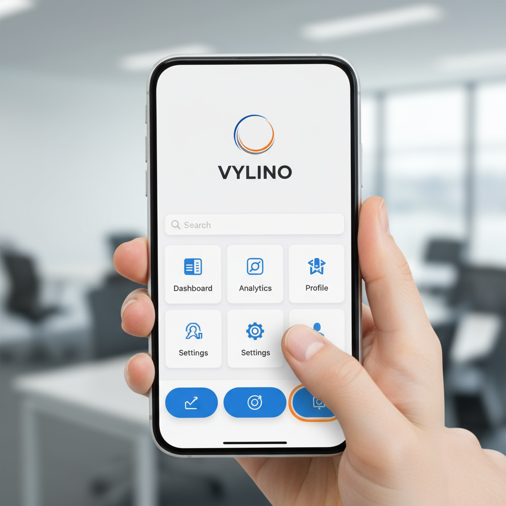
Responsive web design uses flexible layouts, scalable media and CSS rules so a single page can adapt to different viewport sizes. The same URL and core HTML can serve users on phones, tablets, laptops and larger displays while the presentation changes to suit the available space.
Typical building blocks include:
- Flexible layouts using CSS Grid, Flexbox or fluid sizing.
- Responsive images that do not overflow small screens and can serve appropriately sized assets.
- Media queries that change layout or styling when the content needs a different arrangement.
- Viewport configuration so mobile browsers render the page at the intended width.
- Touch-aware controls with usable spacing and interaction states.
- Content reflow so information remains usable without unnecessary horizontal scrolling.
Google’s web.dev responsive-design guidance recommends choosing breakpoints based on where the content needs to change rather than targeting a fixed list of popular device sizes. See web.dev’s media query guidance.
Responsive vs Mobile-Friendly vs Adaptive Design
| Approach | How it works | Main consideration |
|---|---|---|
| Responsive design | One flexible layout adapts continuously or at content-driven breakpoints | Usually easiest to maintain across many screen sizes |
| Mobile-friendly design | A general description for a site that is usable on mobile | A site can be mobile-friendly without being fully responsive |
| Adaptive design | Several predefined layouts are served for particular viewport ranges | More control at specific sizes, but more layouts to design and maintain |
| Separate mobile site | Different mobile URLs or versions are maintained | Adds content, redirect and maintenance complexity |
Google supports multiple mobile configurations, but its current Search documentation recommends responsive web design because it is the easiest pattern to implement and maintain. See Google’s mobile-first indexing best practices.
8 Business Benefits of Responsive Web Design
1. Better Usability Across Devices
A responsive site keeps text readable, navigation usable and controls accessible as screen size changes. Users should not need to pinch-zoom, rotate the device unnecessarily or scroll sideways just to understand ordinary page content.
The business benefit is simple: fewer layout barriers between the visitor and the action you want them to take.
2. One Website to Maintain
Responsive design usually lets a business manage one set of pages, URLs and content rather than maintaining separate desktop and mobile sites.
That simplifies:
- Content updates.
- Analytics and tracking.
- SEO metadata.
- Bug fixes.
- Redirect management.
- QA and ongoing maintenance.
3. Stronger Mobile Search Foundation
Google uses the mobile version of a site’s content for indexing and ranking. Responsive design makes it easier to keep the same important content, metadata and structured information available across screen sizes. That reduces the risk of a mobile version accidentally omitting useful content.
However, mobile-first indexing is not the same as a separate mobile ranking bonus. A responsive site can still rank poorly if its content, relevance, links, performance or overall quality are weak.

4. More Consistent Brand Experience
Responsive design lets the same brand system—typography, colour, messaging, components and visual hierarchy—adapt rather than fragmenting into unrelated desktop and mobile experiences.
Consistency matters particularly when users move between devices during a longer buying journey.
5. Better Foundation for Accessibility
Responsive layouts support reflow, zoom and different viewport sizes, which can help users with low vision and people using smaller screens. W3C’s WCAG guidance requires most content to reflow without loss of information or functionality at an equivalent width of 320 CSS pixels, except where a two-dimensional layout is genuinely necessary.
See the W3C guidance on reflow.
Responsive design alone does not make a site accessible. Contrast, keyboard navigation, focus states, semantic HTML, form labels, alt text and other accessibility requirements still need separate attention.
6. Better Support for Future Screen Sizes
Content-driven layouts are more resilient than designs created around a few named devices. New phones, tablets, foldables, browser windows and display sizes do not require a new website every time.
The goal is not to predict every future screen. It is to build components that remain usable as available space changes.
7. Easier Analytics and Conversion Measurement
Using one URL structure across devices keeps analytics simpler than maintaining separate mobile and desktop URLs. You can still segment performance by device while measuring the same landing pages and conversion events.
8. Lower Long-Term Complexity
Responsive design can reduce duplicated development and maintenance compared with managing separate device-specific sites. It does not automatically make a project cheap, but it can reduce avoidable complexity over the website’s lifecycle.
Responsive Design Does Not Automatically Mean Fast
This distinction is important. A responsive page can still be slow if it loads oversized images, heavy JavaScript, too many fonts, autoplay media or unnecessary third-party scripts.
Good responsive implementation should consider:
- Responsive image sizing and modern image formats.
- Width and height attributes to reduce layout shifts.
- Lazy loading for appropriate below-the-fold media.
- Efficient CSS and JavaScript.
- Font loading strategy.
- Server response and caching.
- Third-party scripts.
- Mobile network and lower-powered device conditions.
If speed is already a problem, a redesign should include performance work rather than assuming responsiveness alone will fix it. Vylino’s website audit can help separate layout problems from performance and technical issues.
Core Web Vitals for Responsive Websites in 2026
The current Core Web Vitals are LCP, INP and CLS. The old First Input Delay (FID) metric has been replaced by Interaction to Next Paint (INP).
| Metric | What it measures | “Good” threshold |
|---|---|---|
| LCP | Loading performance | 2.5 seconds or less |
| INP | Interaction responsiveness | 200 milliseconds or less |
| CLS | Visual stability | 0.1 or less |
Google recommends evaluating these at the 75th percentile of real page loads, segmented by device. See web.dev’s Core Web Vitals guidance.
Responsive design can affect all three. A large mobile hero image can hurt LCP; heavy menu or filtering JavaScript can hurt INP; images or ads without reserved dimensions can contribute to CLS.
Technical Features of a Good Responsive Website
Content-Driven Breakpoints
Do not choose breakpoints simply because a particular phone is 390 pixels wide or a tablet is 768 pixels wide. Resize the layout and add a breakpoint when content becomes awkward, crowded or difficult to read.
Fluid Layouts
Modern CSS Grid and Flexbox can allow components to grow, shrink, wrap and reflow without forcing every dimension into fixed pixels.
Responsive Images
Images should fit the available width, reserve their layout space and, where practical, allow the browser to select an appropriately sized file.
Readable Typography
Line length, font size, line height and spacing should remain comfortable across viewports. Simply scaling all text down on small screens is not good responsive typography.
Touch-Friendly Interaction
Buttons and links need enough size and spacing for touch input. Hover-only interactions should have usable touch and keyboard alternatives.
Responsive Tables and Complex Content
Pricing tables, comparisons, maps, dashboards and data-heavy sections need deliberate treatment. Depending on the content, that may mean stacking, transforming, allowing contained horizontal scrolling or providing an alternate representation.
Stable Navigation
Mobile navigation should preserve access to important pages and actions rather than hiding essential content simply because space is limited.
Mobile-First Design: What It Really Means
Mobile-first design starts with the constraints of the smaller viewport and progressively enhances the experience for more available space.
It encourages teams to decide early:
- Which content is genuinely important.
- What the primary call to action is.
- How navigation works with limited space.
- How forms can be simplified.
- Which assets are essential.
- How touch interactions behave.
Mobile-first does not mean desktop users receive an enlarged phone layout. The larger-screen experience can still use richer layouts and interactions where they improve usability.
Responsive Web Design and SEO: What It Helps—and What It Does Not
| Responsive design can help with | Responsive design does not guarantee |
|---|---|
| Consistent content across devices | Higher rankings by itself |
| One URL structure | Fast loading automatically |
| Simpler mobile crawling and maintenance | Good Core Web Vitals automatically |
| Usable layouts on mobile | Strong content or backlinks |
| Reduced risk of mismatched mobile metadata | Better conversions without good messaging and UX |
Google explicitly recommends responsive web design as an easy-to-implement and maintain mobile configuration, but search performance still depends on the page’s overall relevance and quality.
For a broader view of what a complete design engagement should include, see Vylino’s professional web design services buyer’s guide.
Common Responsive Design Mistakes
- Designing only at three fixed screenshots. Real browser widths exist between the mockups.
- Hiding important mobile content. Smaller screens should change presentation, not remove useful information without a reason.
- Using desktop navigation unchanged. Large mega menus rarely translate directly to phones.
- Loading desktop-sized imagery on mobile. Visual responsiveness does not guarantee efficient asset delivery.
- Using hover as the only interaction state. Touch devices and keyboards need alternatives.
- Forgetting landscape orientation. Height constraints can expose problems even when width looks fine.
- Ignoring zoom and reflow. Responsive design should remain usable when users enlarge content.
- Testing only in a browser simulator. Real devices can reveal keyboard, viewport, touch and performance issues.
- Assuming responsive equals accessible. Accessibility requires additional design and code decisions.
Responsive Website Testing Checklist
Before launch, test more than whether the page “looks okay” at a few widths.
| Area | What to test |
|---|---|
| Layout | No unintended horizontal scroll, overlaps or cut-off content |
| Navigation | Menus, submenus and important links are reachable |
| Forms | Fields, keyboards, validation and submit states work on mobile |
| Touch | Buttons and links are comfortably tappable |
| Typography | Readable without pinch-zooming |
| Images/media | Correct sizing, cropping, loading and layout reservation |
| Tables | Still understandable on narrow screens |
| Orientation | Portrait and landscape both remain usable |
| Performance | Test on realistic mobile conditions and field data where available |
| Accessibility | Keyboard, zoom/reflow, labels, focus and contrast checks |
When Does an Existing Website Need Responsive Redesign?
Consider a responsive redesign when users regularly encounter any of these issues:
- Horizontal scrolling on ordinary pages.
- Tiny text or controls on phones.
- Menus that are difficult to use on touchscreens.
- Forms that break or require zooming.
- Desktop-only sections hidden entirely on mobile.
- Tables or images that overflow the screen.
- Separate mobile URLs that create maintenance problems.
- Mobile conversion paths that are significantly harder than desktop.
- Repeated layout problems as new content is added.
If the current site needs structural improvement rather than a new website from scratch, review Vylino’s website redesign services.
How to Choose a Responsive Web Design Company
“Responsive” should be demonstrated in the provider’s process, not simply listed as a feature.
Check Live Portfolio Sites on Your Own Phone
Do not judge responsiveness from desktop screenshots. Open several live projects and test navigation, forms, content, tables and speed yourself.
Ask How Breakpoints Are Chosen
A thoughtful answer should discuss content and component behaviour rather than only naming standard Bootstrap/device widths.
Ask About Real-Device Testing
Browser emulation is useful, but mature QA should also include representative real devices or device farms where practical.
Ask About Performance
Responsive design and performance should be planned together. Ask about images, fonts, JavaScript, caching and Core Web Vitals—not only visual breakpoints.
Ask About Accessibility
The provider should understand reflow, keyboard operation, focus, form labels and touch interactions. Vylino also offers dedicated UI/UX design services for projects where interaction design requires deeper work.
Ask What Happens After Launch
Responsive issues can appear later as content, plugins, products or integrations change. Clarify the support and regression-testing process.
Frequently Asked Questions
What are the main benefits of responsive web design?
The main benefits are better usability across screen sizes, simpler maintenance, one URL/content system, a stronger mobile-search foundation, more consistent branding, easier analytics and better support for reflow and future devices.
Does responsive web design improve SEO?
It can support SEO by making mobile content consistent and simplifying crawling and maintenance. Google recommends responsive design as a mobile configuration, but responsiveness alone does not guarantee rankings.
Is responsive design the same as mobile-first design?
No. Responsive design describes how the layout adapts. Mobile-first describes a design approach that starts with smaller screens and progressively enhances the experience for larger ones. A site can be responsive without having been designed mobile-first.
Is responsive design enough for Core Web Vitals?
No. Core Web Vitals depend on loading, interaction responsiveness and layout stability. A responsive site can still fail LCP, INP or CLS if its assets, JavaScript or layout behaviour are poorly optimised.
What are the current Core Web Vitals?
In 2026 they are Largest Contentful Paint (LCP), Interaction to Next Paint (INP) and Cumulative Layout Shift (CLS). FID is no longer a Core Web Vital.
Should every website use the same responsive breakpoints?
No. Breakpoints should primarily be chosen where the content or component needs to change. Fixed device presets can be useful for testing, but they should not dictate the entire design system.
How do I know whether my website is truly responsive?
Resize the browser and test real phones/tablets. Look for horizontal scrolling, overlapping elements, inaccessible navigation, broken forms, unreadable text, overflowing tables and controls that are difficult to tap.
Final Takeaway
Responsive web design is no longer a special feature added at the end of a website project. It is a foundational way of designing for a web that is accessed through many screen sizes, input types and user needs.
The strongest responsive websites combine flexible layouts, content-driven breakpoints, accessible reflow, mobile-first thinking, efficient media, good performance and rigorous cross-device testing.
If you are planning a broader website build, the next guide in this series explains the types of website development services and how to choose between them.



 English
 हिन्दी
 Español
 Français
 Deutsch